A new digital blueprint for King + King Architects.
Stephanie Freier
Sr. Digital Content Strategist
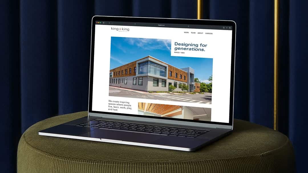
A modern digital presence for a historic firm.
The new website for King + King Architects brings their legacy of thoughtful design into a modern digital experience – one that highlights their work, their people, and their impact across New York State.
Every project starts with strategy.
When the oldest architecture firm in New York State partners with us for a website redesign, the goal isn’t just a fresh look. It’s creating a digital experience that reflects more than a century of design expertise while making it easier for clients, partners, and potential employees to explore the firm’s work.
For King + King Architects, their website needed to evolve alongside their reputation. The firm has built an impressive portfolio of award-winning work across healthcare, higher education, and more – but their digital presence wasn’t fully telling that story.
Through collaborative discovery, we identified several opportunities:
Bring the brand to life
Tell the story of each project rather than just showing the work
Highlight their talented people and the experience of working at King + King
Branding refresh.
Using their existing logo as the base of our website refresh, we updated their fonts and colors to give them more options. We used the grid structure from the plus in their logo as inspiration and looked at ways to bring it to life throughout the site.
Scaffolding the site.
King + King wanted their case studies to be as dynamic as their work. By using a few different grid systems throughout the site, we were able to keep the experience fresh while providing more structure when it would help users.
To make reviewing their work easier for prospective clients and recruits, their project grid transforms from an artistic arrangement into a uniform layout when a filter is applied.
We created a library of components and layouts for them to use and kept each case study unique to allow them to tell the story behind the space.
Highlighting their people.
A major focus of the redesign was showcasing their people, culture, and office life. We refreshed their team page with new headshots and an updated grid layout.
Updated office photography is sprinkled in throughout the site to show off their people, history, and culture.
Crowley Webb has been an excellent teammate throughout the entire process, from evolving our brand to launching our new website.
Zach Leader, Sr. Marketing + Graphics Coordinator, King + King
Built for today and what’s next.
Behind the visual refresh is a UX framework designed to support both users and long-term growth for King + King.
Key improvements include:
Clearer information architecture that makes it easier for users to find relevant projects
Flexible project templates that allow King + King to easily showcase new work
Improved user journeys that guide clients and potential employees to take action
Mobile-first design that ensures a seamless experience across devices