A new logo for UNC Dairy.
Matt Low
Chief Creative Officer
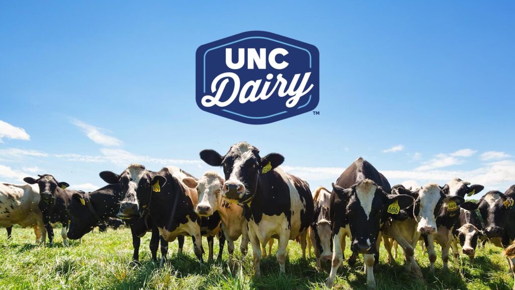
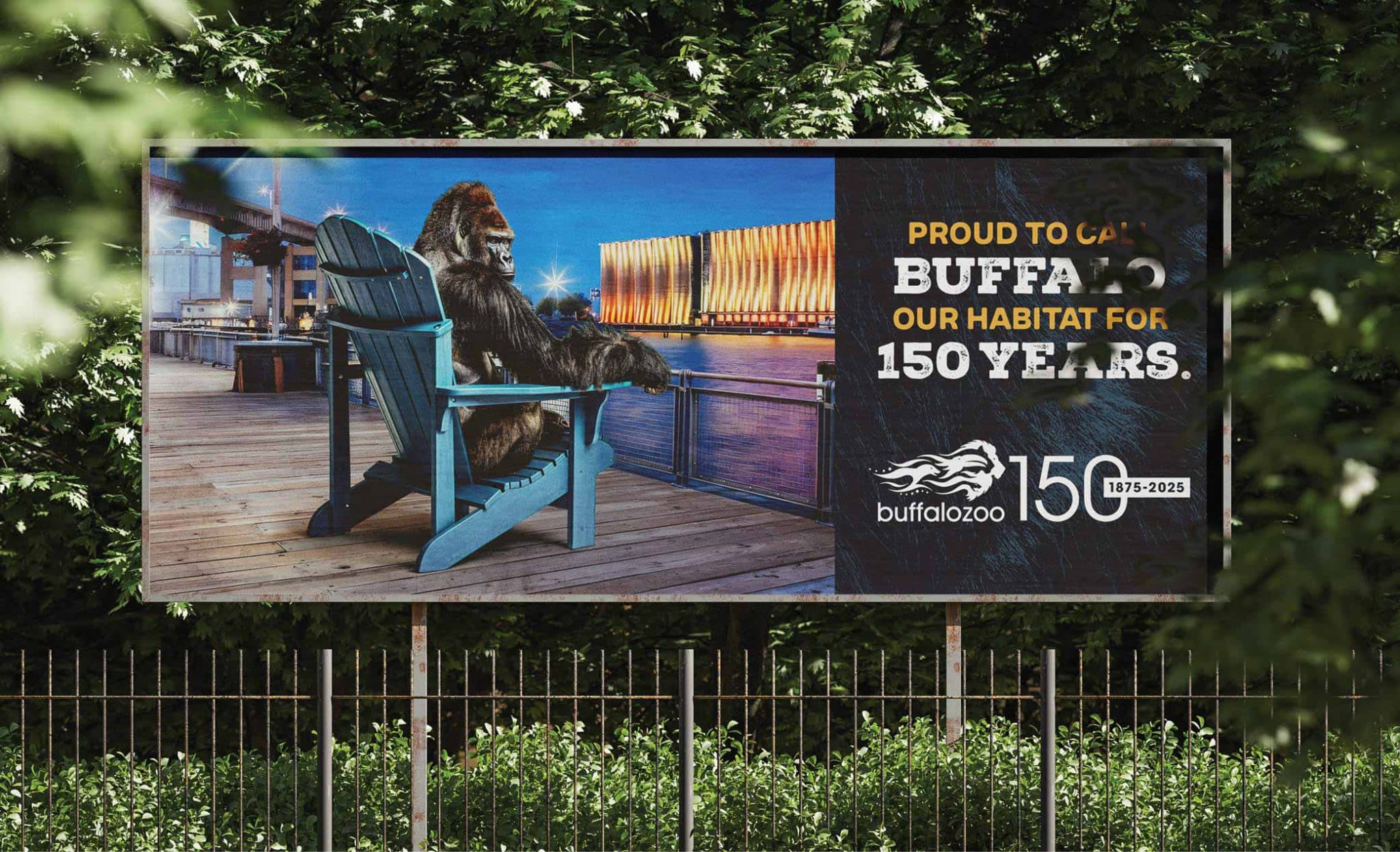
We recently had the opportunity to update the branding for our new client Upstate Niagara Cooperative with a new logo and elements more reflective of the company’s vision for the future.
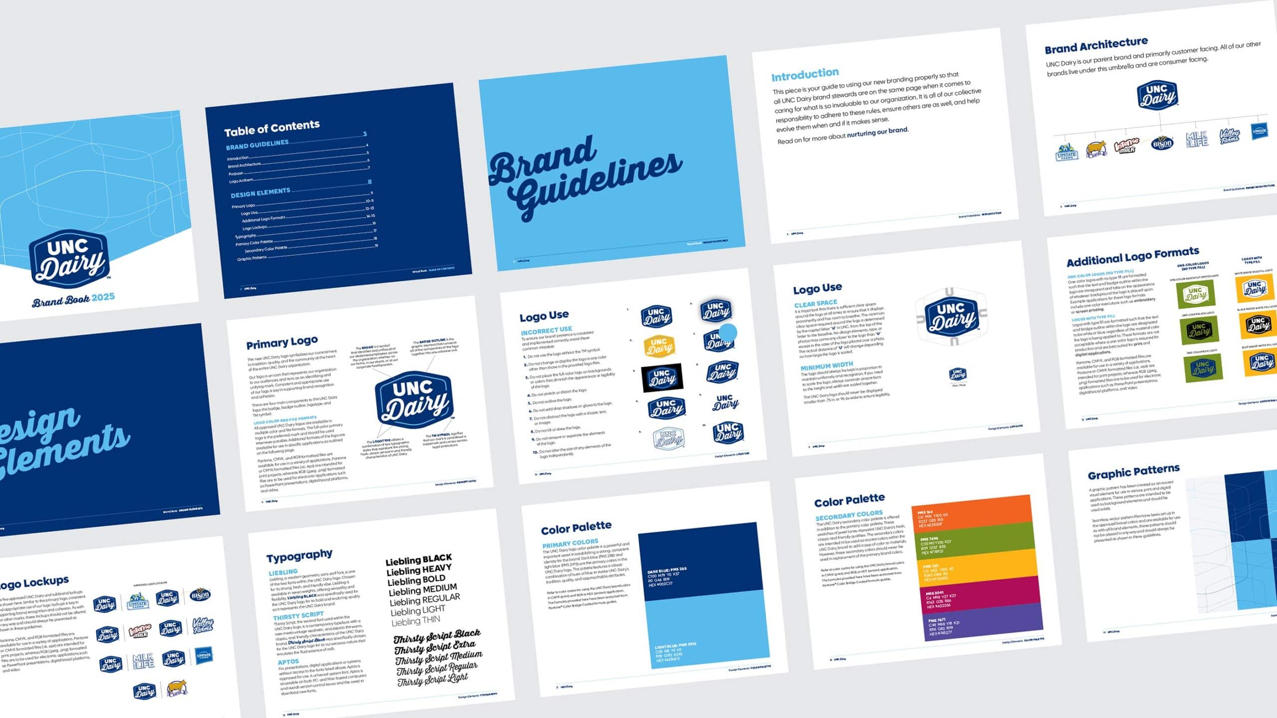
Right now, the brand is focused on positioning themselves as a leader in dairy production and manufacturing. They have consumer brands, but they are also a major player in B2B. When they’re with global buyers, they need a logo that conveys their leadership position in dairy manufacturing. So “dairy” was key. We also discovered they had already been informally referring to themselves as “UNC.” The new logo was a move to embrace both of these.
Andalyn Courtney, VP, creative director here at Crowley Webb led the charge, and I sat down with her for further insight on the project and her overall approach to logo creation.
Matt: For those who may not know, can you give us your title and a bit of your background in the industry?
Andalyn: Sure. I am a creative director here at Crowley Webb. My background is in design and visual communications. I’ve worked in advertising for 25 years and spent a good 10 in-house for higher education institutions.
Matt: What was the impetus for this new logo?
Andalyn: Well they had a logo that was very corporate. Not friendly, approachable, modern, or reflective of who they are as an organization. So they needed to have an easier way to refer to who they are visually and verbally.
Matt: And we landed on the name UNC Dairy, which still hearkens to Upstate Niagara Cooperative, but also puts that “dairy” front and center. Was that part of the strategic thinking when you got into first ideating around a new logo?
Andalyn: Yeah, it’s a challenge because you want to create distinction between the “UNC” and “dairy” So, the mark wanted to be more inclusive of their name and not necessarily a logo with a bug like a Nike swoosh with an icon that’s separate from the name.
Matt: So how many designers did you put on this? And what was your approach to that?
Andalyn: Logos aren’t always easy to approach. And stylistically, there could be a lot of range. But I’m one art director, one designer. I can design within a range, but I still only have my one mind. I’m going to think about the logo from my own perspective. So I feel like putting more art directors on a project like this, especially one where we’re trying to reestablish the aesthetic of the brand, is helpful. When you have more people, more styles, more thinking, you get more approaches.
Matt: How do you begin a project like this?
Andalyn: Well, this time I automatically had an idea, and a place to start. So I started playing around with “UNC” and from there just kind of iterated, then one idea became another idea that became another idea. Yeah, I mean, I could look back in my notebook and there are probably like a dozen logo ideas. But playing around with “UNC” was where I started.
We also came upon this vintage Upstate logo when we visited to one of the many farms that was inspiring.
At another, one of the farmers, Roger, had a button-down shirt on, and in my memory his shirt had a name patch on it. I honestly cannot say for sure that it did, but in my recollection it was there. To me, a name patch on a button-down shirt represents pride and hard work, and hearkens to tradition and quality. Roger exuded all of these characteristics, and as I thought about it, so did the farmer we met earlier that day, and so does the cooperative as an entity. So whether Roger’s shirt had a name patch on it or not, it was what inspired what became the UNC Dairy logo.
Matt: How do you know when you have the one?
Andalyn: Well, usually it’s a gut instinct, you feel it that you’ve gotten it where you want to go. But then the next day I’ll go back and change it and change it. But when I feel like I’m comfortable enough that I want to share it with someone, then I feel good about it.
Matt: How do you get from two dozen to a number you felt comfortable with bringing to the client?
Andalyn: I usually try to bring in more objective perspectives and look to gain alignment. But sometimes you might like something that I might not for a different reason. But it’s always different.
I mean, the client ended up choosing the very last one that I created. It seemed to represent everything they wanted. And like I said, you get a gut feeling, and I had it with this one. It feels right and makes a lot of sense.
Matt: Once a logo is selected, what are the next steps?
Andalyn: We then create the logo suite. There are a bunch of file formats, print-ready formats, digital formats, color variation, whether it’s spot color for certain production needs, four-color process for other production needs. And then you have the variations where you have the primary logo and then you have different options for putting it on different colored backgrounds and creating all the rules around that.
Matt: Any final thoughts?
Andalyn: We do a lot of logos for different reasons. But this one just from a corporate brand perspective is a big logo. They have consumers, they have customers, they have farmers, they have all these internal and external audiences, so I give them credit for being bold.
Matt: And the logo they picked is exactly what we presented, which is another marvel.
Andalyn: Well, we had to add a “TM” to it, but not that big of a deal.
Matt: Well, it’s incredible work and everybody’s happy, and that’s what matters.
Andalyn: Exactly.