Design tips for beginners.
Designing anything from scratch can be intimidating. Your content is important, but the way you present the information can impact a viewer’s first impression, comprehension, and engagement. Keeping a few design staples in mind will ensure your work – whether it’s a PowerPoint presentation, a flyer, or an advertisement – looks polished and professional.
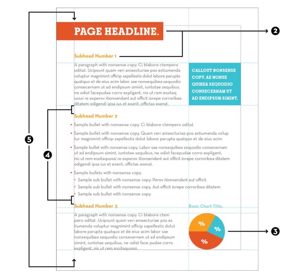
1. Establish a color palette.
This is the first step to making a design feel cohesive. Try limiting your palette to three or four colors. Within the palette, one or two of the colors should be the primary colors that are used most frequently. You can choose a bright secondary color to call out important information – using the secondary color sparingly will ensure the important information stands out to the viewer.
2. Choose the right fonts.
We all know to avoid Comic Sans if we want to be taken seriously, but even still, selecting the right font can be daunting. Keep your audience in mind and match the font to the tone of your content. A quirky font can be fun in a presentation for children, but if you’re creating a client presentation, choose something that comes off as more professional. Fonts can be mixed and matched – just avoid using more than two in most instances. If you’ve selected a more elaborate font, use it sparingly (for example, in the headline and callouts) and pair it with a more legible font for the heavy body copy – like in a brochure.
3. Use cohesive visuals.
Photographs and diagrams make your layout more engaging and can help break up content-heavy materials. If possible, choose visuals that have a similar style. For example, charts or diagrams that use your color palette are best, but if that’s not possible, try to make sure the colors pair well together so that the visuals don’t look out of place. When using photographs, pay attention to the lighting, areas of focus, and cropping so that they pair well together.
4. Maintaining consistency is key.
When you think of design, consistency probably isn’t the first thing that comes to mind, but it is one of the most important components in keeping your information organized. Pay close attention to the spacing between bullets, paragraphs, and content sections to ensure they match. Treat all subheads of similar importance with the same font, color, and size. Create a system of bullets and sub-bullets that can be used throughout a piece. This way, the hierarchy of information is obvious to the viewer.
5. Check for alignment.
Well-organized layouts all have one thing in common: alignment. Some designers even use a grid to ensure they can hit as many alignment points as possible. In most layouts, type should be left aligned on the page. Keep subheads aligned with one another, and bullets aligned underneath. If visuals are within your body copy, size them so that the top or bottom can line up with corresponding content. These small adjustments will make your work look much cleaner.
Check out this sample layout with all the design tips in place. See how many you can find!
Katelyn Killoran

Sr. Art Director