Huddle up for a little sports branding.
Just last week, Todd Radom visited Buffalo and dropped some knowledge on us as part of the AAF Buffalo Spotlight Speaker Series. While also an illustrator, writer, and researcher, his prime focus is sports branding. He talked about the unique visceral nature of the sports fan and how this drives a level of loyalty unmatched by any other type of branding known to man. Just ask any season ticket holder of a certain team that hasn’t been relevant since before Y2K.
Todd talked about the nuances of his work, his love of hand-lettering type, and whole lot of baseball. So for all the branding/sports junkies in the house, it was nothing less than a, well, you know.
In the spirit of this topic, we invited some of our art people to share hot takes on their favorite sports logos. Grab a hot dog and a plastic cup filled with foamy beer and enjoy!
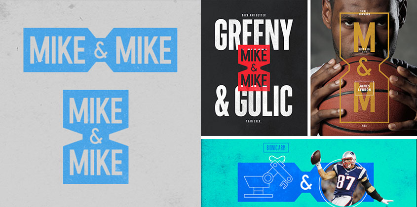
Lillian Selby: Mike & Mike
You don’t have to be a sports fanatic to appreciate some morning banter between Greeny and Golic while beautiful design is flying at your face. The identity system is bold, sporty, and straightforward, and it allows for so much versatility in their motion graphics.
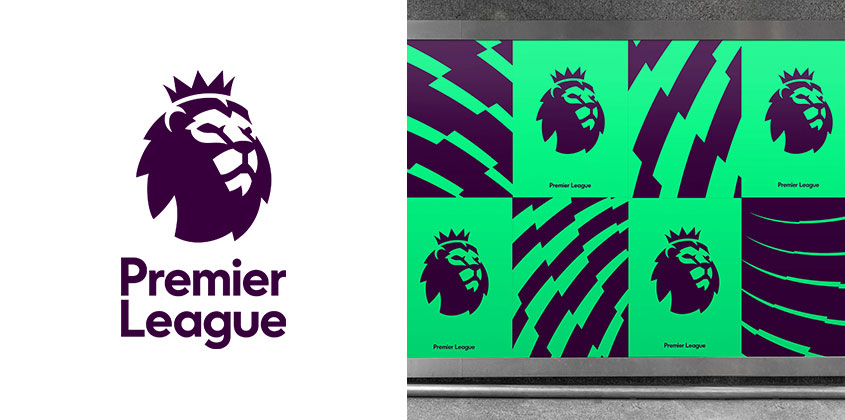
Darryl Colling: English Premier League
The league unveiled this rebrand identity for the 2016/2017 season. I think it’s a nice evolution of an iconic logo. It’s modern, clean, and fresh, yet it still has a regal feel like its predecessor. And its simplicity makes it very distinct and versatile.
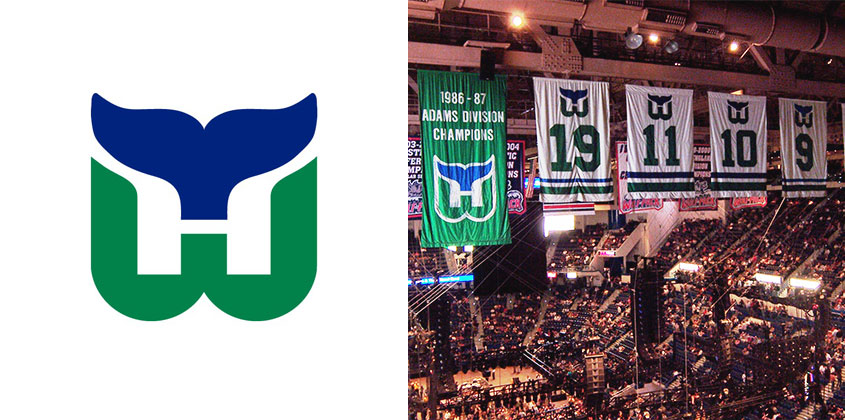
Katie Hazel: The Hartford Whalers
I’ve always liked the logo of this defunct NHL team. It’s simple and memorable and has a little charm to it. I love how it works the initials of both the city and the club into the signature whale tail – and that the mark uses only two simple colors.
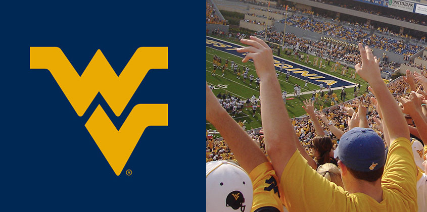
Nicole Reinard: West Virginia University
I love that this logo relies solely on the type to create a strong, powerful, and timeless mark. The interlocking W and V give a sense of strength and unity, while their zigzags bring tons of energy.
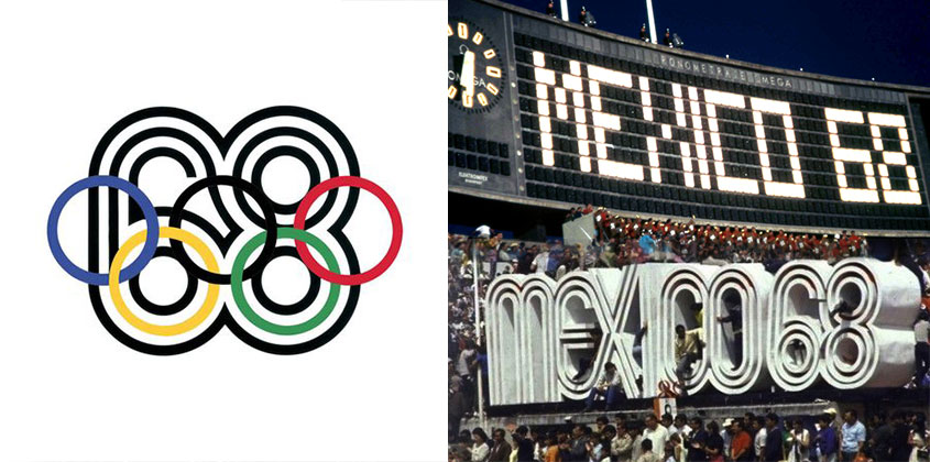
Nate Benoit: 1968 Summer Olympics
This is one of my favorites of the Olympics. The way the rings were incorporated into the “68” is pretty brilliant. To most, this design might seem simple, but there was a lot of thought put into it. The logo was influenced by Mexican folk art and 1960s pop art – and it still looks relevant, even by today’s design standards. I think that Lance Wyman did an excellent job!
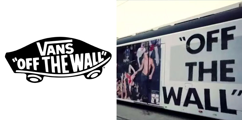
Bonus Nate Benoit: Vans Off the Wall
The Off the Wall logo from Vans has always stuck with me over the years. This logo has a very organic look and feel to it, with the use of rounded type and smooth streamlines. Also the name “Off the Wall” was a term skateboarders in the ’70s used when riding the pools. Overall, I love Vans as a brand, and their look will be one that influences my designs the most.
Matt Low

Chief Creative Officer