A new identity for the Buffalo Philharmonic Orchestra.
Few institutions in Buffalo are as well known, revered, and respected as the Buffalo Philharmonic Orchestra. Founded in 1935, the BPO has long served as Buffalo’s cultural ambassador, performing live music that educates and entertains audiences within and beyond the Western New York region.
Over the last decade, the BPO has become increasingly ambitious with its programming in an effort to satisfy the musical interests of a wider and more diverse audience throughout the Buffalo area. But the organization didn’t feel its logo reflected that.
Developed as an interim identity during a time of transition, the logo lived on longer than initially planned. That is, until 2016, when BPO leadership decided it was time to take the orchestra’s identity to a new place with something that would truly represent the power of the organization and the unique role it plays in the Buffalo community.
So they came to us.
We got to work, conducting both qualitative and quantitative research to better understand perceptions and opinions surrounding a new identity for the BPO. We surveyed key stakeholders, including musicians, patrons, and community leaders, and here are some of the primary characteristics of the BPO that emerged from this research and informed our creative direction.
Inclusive.
The BPO is welcoming and open to everyone.
Contemporary.
The BPO serves individuals with varying musical interests and isn’t limited to the classical crowd.
Community focused.
The BPO has a significant relationship with Buffalo and the Western New York community.
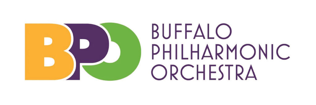
Respondents also overwhelmingly told us that they felt the new logo should represent excitement, energy, vibrancy, and youthfulness, and it should convey the strong ties the orchestra has to its audience. With this information in hand, we started designing the new logo. And here’s what we came up with.
![]()
Speaking to the design, Dave Buck, creator of the logo, said: “The new mark represents maestro and orchestra, or orchestra and audience, if you prefer. Just as importantly, it symbolizes the organization’s long-term, positive effect on the community.”
The BPO is currently experiencing much success both locally and internationally, and the organization is excited to reflect that with a new look. “This is going to catapult us into 2017 with a renewed sense of energy and enthusiasm for the BPO musicians, staff, board, and all patrons,” says Dan Hart, BPO executive director.
Interested in seeing more of our work? Check out our portfolio. And, feel free to get in touch with us about your next project.