A bold branding move for a beloved theatre.
After 35 years of shaping stories and sparking creativity, MusicalFare was ready for a rebrand, one that honored its legacy while creating excitement for what’s next. So, when they came to us with big news – new space, new season, new era – we knew it called for a brand just as ambitious.
Enter: Crowley Webb, stage left.
Setting the scene.
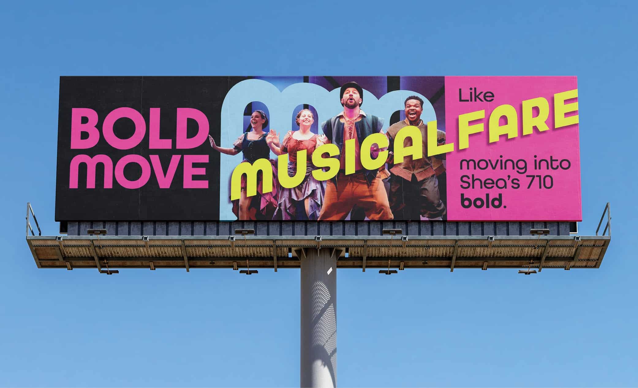
MusicalFare is now the resident theatre company at Shea’s 710 – a beautifully restored, 550-seat space in the heart of downtown Buffalo. It’s a move that represents major growth, allowing for bigger audiences, bigger productions, and bigger opportunities to do what they do best.
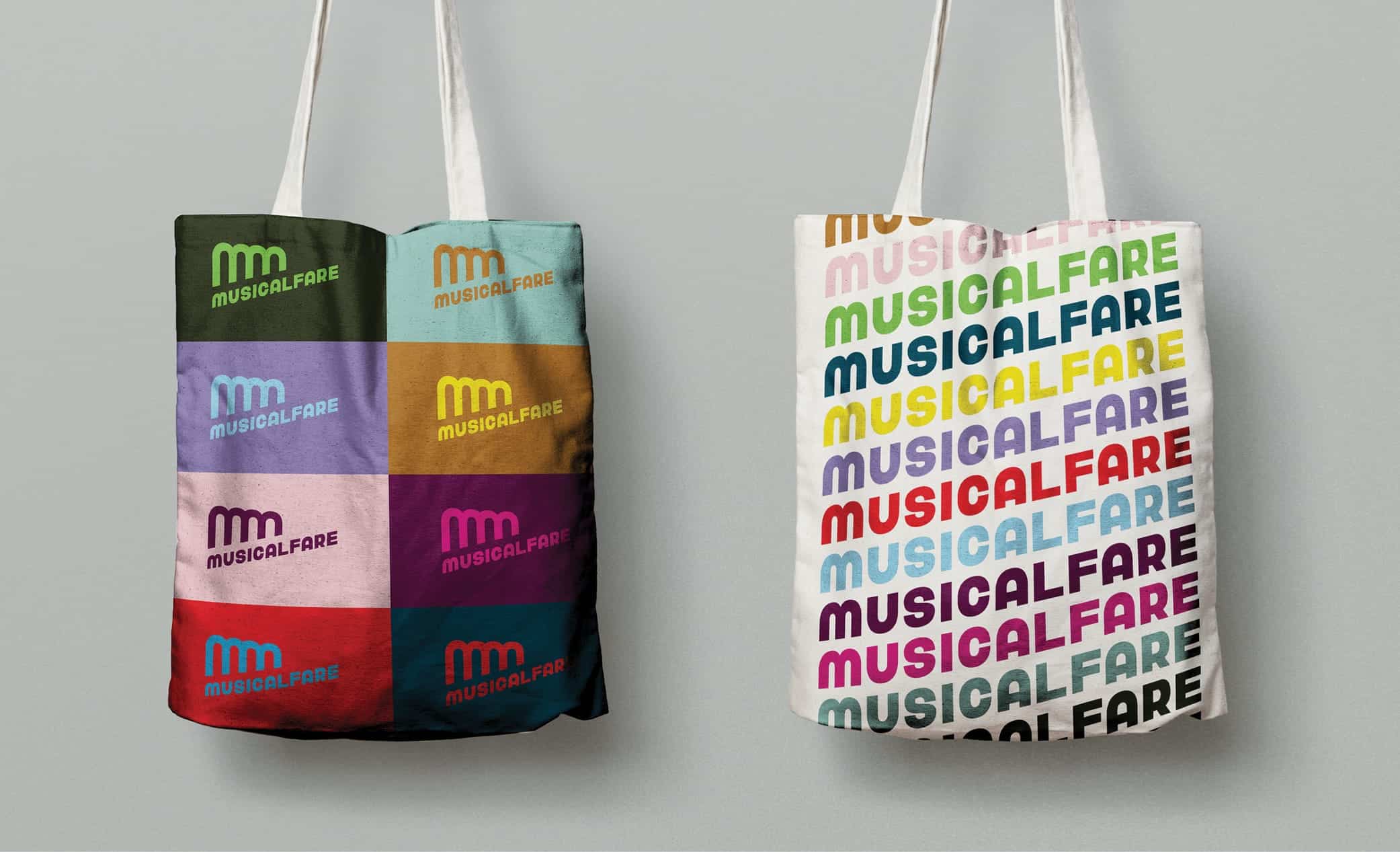
At its core, this rebrand is more than a logo or a new color palette (though we’re pretty excited about those too!). It’s a bold, strategic identity built to capture MusicalFare’s energy, elevate their presence, and support the kind of work they’re creating now and in the future.
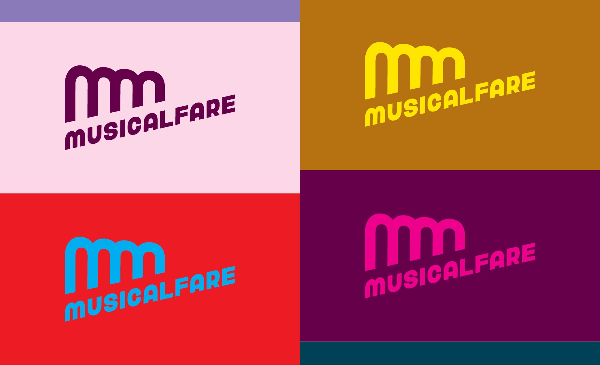
The inspiration is in the arches.
The design inspiration started with the space itself – specifically, the tall, arched windows that define Shea’s 710. Bold and architectural, those arches became the foundation for the new logo.
Designed to perform.
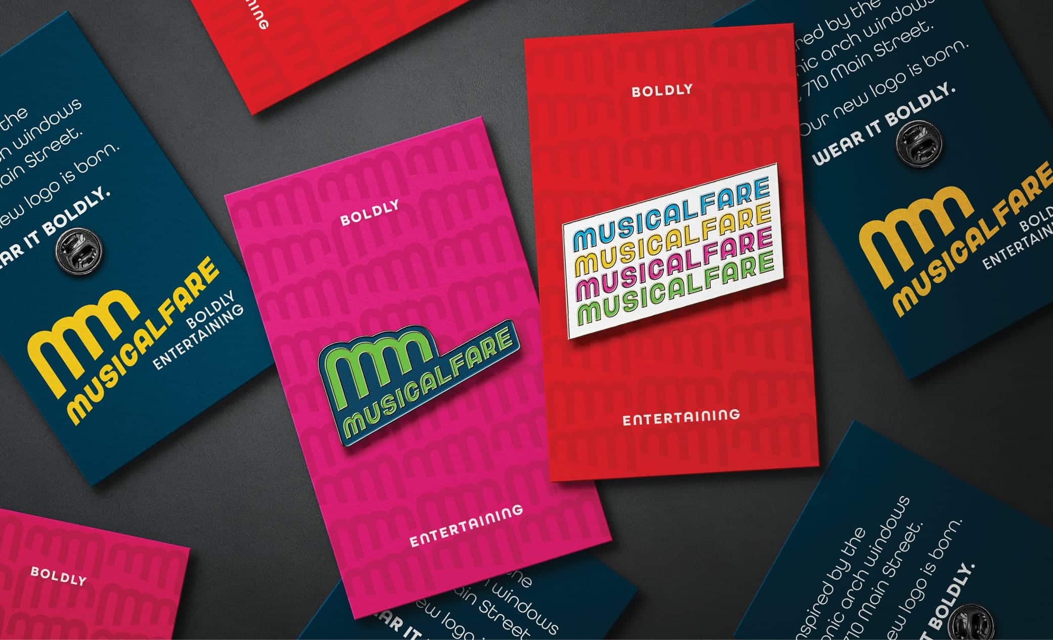
From billboards and season announcements to playbills and merch, this brand had to work hard and look good doing it. So we built a system that flexes across digital and print and gives MusicalFare a cohesive look no matter the channel.
With MusicalFare’s first full season at Shea’s 710 on the way, we’re proud to have helped them build a brand to match their vision, voice, and the work ahead.
Because great storytelling deserves great branding, and we’re always up for what’s next.
Ready to turn your brand into your best asset?
Stephanie Freier

Sr. Digital Content Strategist