Making analytics understandable for all audiences.
The analytics team (or “A-Team,” as we lovingly refer to ourselves) at Crowley Webb is responsible for work requiring expertise in research and statistics. On behalf of our clients, we dive deep to uncover the stories hidden inside data. One particularly important aspect involved in our work is translating our discoveries in ways that allow us to effectively present and communicate our findings to an audience that may not have as thorough of an understanding of analytics. We do this in a variety of ways.
Digesting a bunch of data.
For many reports, we compile data from various sources that range from large customer relationship management (CRM) databases to digital media platforms, such as Google ads and Facebook Business Manager. With data coming from many different sources, it can be difficult to draw insights or create a report simply by looking across each of them. This is where the analytics team comes in.
Our job is to take information from multiple data sources and bring it all together to help form one complete picture. Once the data is organized, it becomes much easier to identify trends and uncover motivators – for example, why people are visiting a website.
However, this is only half the battle. If we were to report on everything we saw in this 360-degree view, our reports would still be too long and confusing for a non-analytics expert to consume. To help with this, we work with our clients to determine key performance indicators (KPIs) and then tailor our reports to cover the information most pertinent to those topics. Some examples include:
- Cost per lead
- Total number of leads per week
- Conversion rate
With this more focused approach, we are able to assemble a report that answers their questions without them having to dig through pages and pages of information.
Using the best visualizations.
Another way we present information is by utilizing a combination of graphs and charts to convey the key data points of the report. When it comes to displaying data visually, it’s not a one-size-fits-all approach. It is important to choose the right type of graph or chart depending on the type of data you’re sharing. An example is presenting how leads came to a website using a pie graph, which shows percentages, or using a chart, which shows any number of metrics in an organized form.
A pie graph quickly identifies what the main drivers were for leads to find the website, but a chart provides additional information, like how many leads there actually were per marketing channel, and what the week-over-week change in total leads was. Using a pie chart to display something like the week-over-week change in total leads would not make sense because a pie chart is best used when trying to work out the composition of something. A pie chart works really well when you have categorical data with each slice representing a different category.
Clearly communicating client performance.
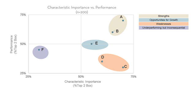
We also perform larger-scale studies for many of our clients, often with the use of online surveys. For most companies, it’s important to understand how well their services or products are performing, particularly when it comes to what is most important for the customer.
For this particular insight, we first ask a group of consumers about a series of product characteristics to determine how important they think each one is. After that, we ask about the same characteristics, but we specifically ask how our client’s product performs with regard to said characteristic.
From these two data points we create a grid that enables us to group the information so we can showcase which characteristics are considered strengths and which are weaknesses based on these ratings (see figure).
Characteristics shown in the upper-right quadrant of the grid highlight what is important and performing well, a.k.a. strengths, whereas those shown in the lower-right quadrant of the grid highlight what is important but not performing well, therefore representing weaknesses.
Although the analytics team is often doing complicated analyses behind the scenes, an important part of our job is to be able to simplify the results so they are easily understood by any audience. We make sure to tailor specifics to each client we work with depending on the scope of their needs and the questions they want answered.
Communicating analytical data to non-analytical clients is an important step in our process that allows us to use our statistical knowledge to solve problems for our clients while sharing the information in actionable ways. By communicating complicated analyses into more digestible content, the client can implement action steps based on informed decisions.
Learn more about our analytics services from our capabilities page. And if you’re interested in seeing what our A-Team can do for you, get in touch!
Shannon Coleman

Data Analyst